My latest LA visit...Ed Ruscha retrospective at LACMA
Why am I so nervous each time I prepare to write a post? I’m nervous each day before I start painting as well, so I’m guessing it’s the excitement getting the better of me. In both arenas there’s just so much to say. What’s the right way to say it? Sometimes, you just have to start because time’s a-ticking.
I’m typically in LA, my hometown, every 4-6 weeks. Since the photographer who shoots my paintings, my canvas builder, frame shops, and a friend who paints my metal frames are all scattered throughout LA, I’m always dashing about, which means I’m also always close to a friend, museum, or favorite taco stand (and Folliero’s… seriously THE best pizza on the planet).
I was invited to spend a day talking with some art classes at my former high school last week, a chance to reflect on my own time in Downey. Time certainly does fly.
In between the school visit, getting two new paintings photographed, and picking up a new canvas and a few frames, I was able to visit Ed Ruscha’s new retrospective, Now Then, at LACMA. I’d been looking forward to this show for months. The exhibition debuted at MOMA last year, and I was hoping to see it there, but wasn’t able to make it happen. Perhaps it was for the best. I’m an LA artist, and Ed is the indisputable king of Los Angeles art, so it seems fitting that I’d see the show in LA on the most perfect sunny day. Is this just me spinning a narrative to rationalize and romanticize the situation? Absolutely, and I’m thrilled to do it.
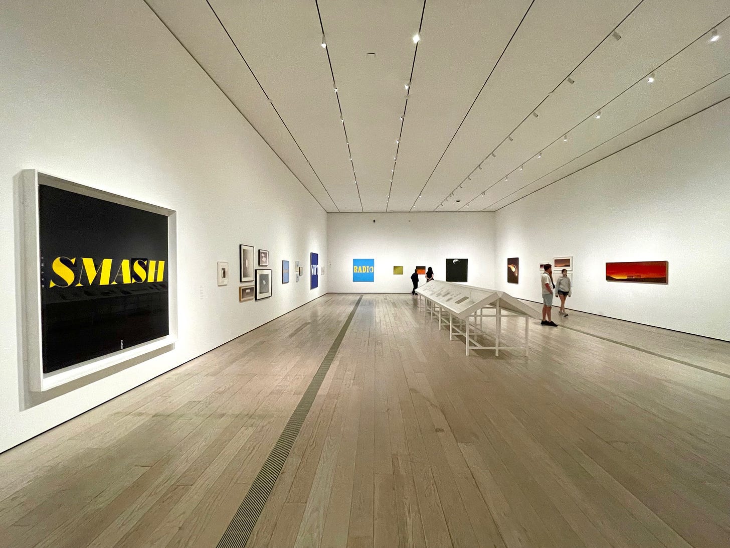
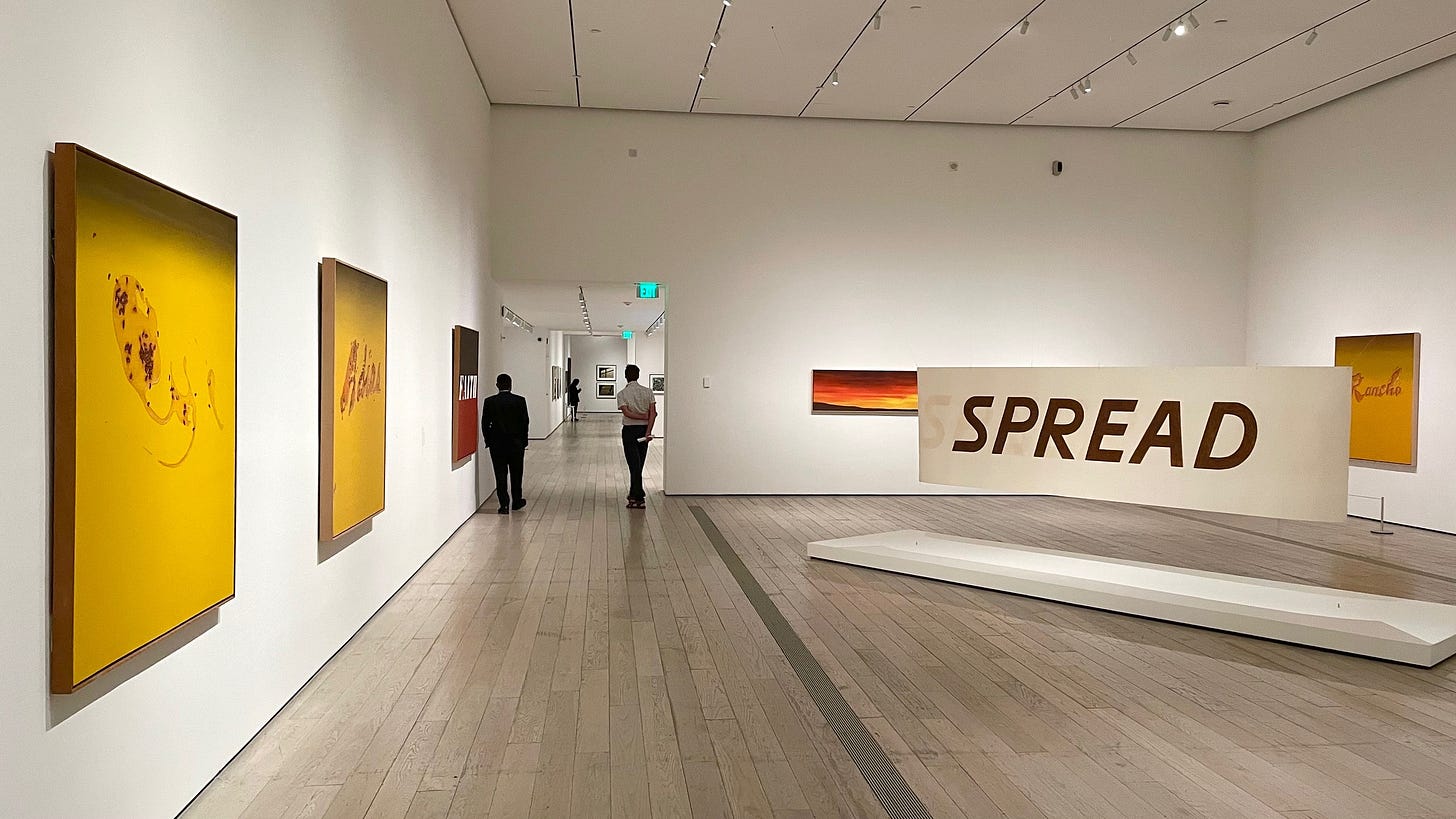
First, I’ll tell you that this show does not disappoint. Go see it. It’s not a given that great shows will actually be great experiences. Lighting and room dynamics can be bad. Flow can be wonky. Installation can be contrived. As my friend Bill said, and I had to agree, the show feels as if Ed designed it all himself. I wouldn’t be surprised if he did. But I’ll comment more on that in a bit.
As a bit of background, Ed Ruscha was born in Nebraska, raised in Oklahoma, and moved to LA in the mid 50’s. For many Angeleno’s, his work both captures and creates the Los Angeles aesthetic. I’m personally so grateful for the standard and tone he set.
OK, so many of you know my favorite artist is Wayne Thiebaud. Ed Ruscha is most definitely my second favorite, and the power of the two artists’ work is enough to sustain me. My own work will never shine as bright as theirs, and it doesn’t matter one bit. I’m just so glad to have their work in my life. I’d like to share my thoughts on how Wayne and Ed relate to each other, and how they don’t. Thiebaud and Ruscha are both quintessentially California artists. There is a distinct California aesthetic(clean, colorful, minimal) and their bodies of work fit perfectly within it. As it happened, America’s first Pop Art museum show, in 1962, included both of their work, among only six other artists. The landmark show was called New Paintings of Common Objects(Ruscha designed the poster), and it was curated by the incomparable Walter Hopps at the Pasadena Art Museum. In reality, Wayne was not a Pop artist at all, but people didn’t realize it at the time. In my mind, Ed was only a Pop artist for a short time, before evolving into something altogether different.
Aside from the mutual California aesthetic and inclusion in the first Pop Art museum show, Ruscha and Thiebaud’s work share an affinity for humor. There are many simlarities to notice, but there are differences as well. For me, the biggest difference is tone. What I love about Wayne is his warmth. His art exudes warmth. Ed, however, is defined by his coolness. He is the king of cool. In this regard, the two artists couldn’t be further apart. Wayne’s paint always looks juicy, wet on the canvas. His juicy brushstrokes and globs of paint point to the presence of a human hand. Ed’s application is dry and flat, and conveys an almost detached quality.
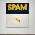
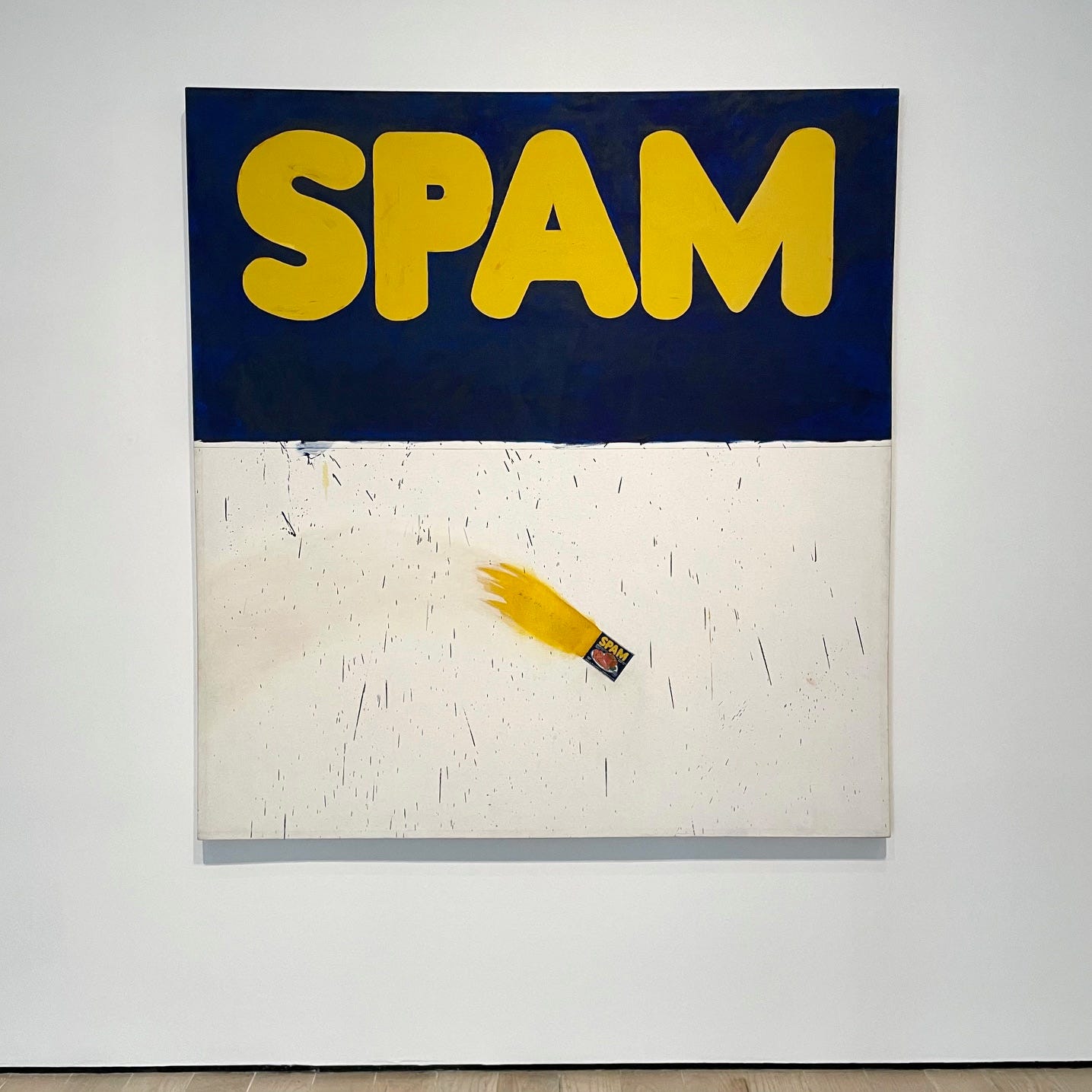
Ok, so the show starts with Ed’s early work, including a painting of Spam called Actual Size, image above. It’s worth noting that Ed created Actual Size the same time that Warhol created the Campbell soup cans. They were both unknown artists at this time, one east coast, the other west, and both works were shown for the first time at Ferus Gallery in LA. It’s clear Ed’s work is fitting into Pop at this time.
To me, he is only just getting started.
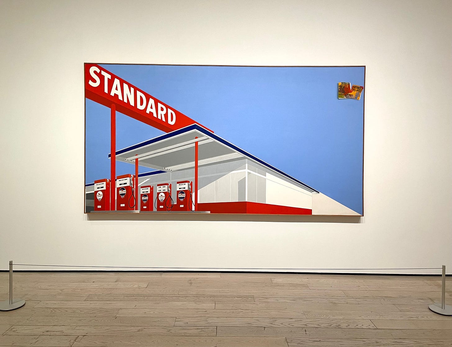
There are hundreds of works in the LACMA show, and although there could be hundreds more, the curators did a wonderful job of representing Ruscha’s oeuvre. Some of Ed’s most iconic works are his many takes on the Standard gas station. These paintings, clean and cool, are spellbinding. Are these meant to be humorous or serious? Or maybe both? Being asked by a friend in an old interview “what should people see?”, Ed replies… ”maybe gas stations”. This says just about all you need to know about the way Ed thinks and sees the world, and it’s fantastic. MOCA created a wonderful short video about Ed a while back, below.
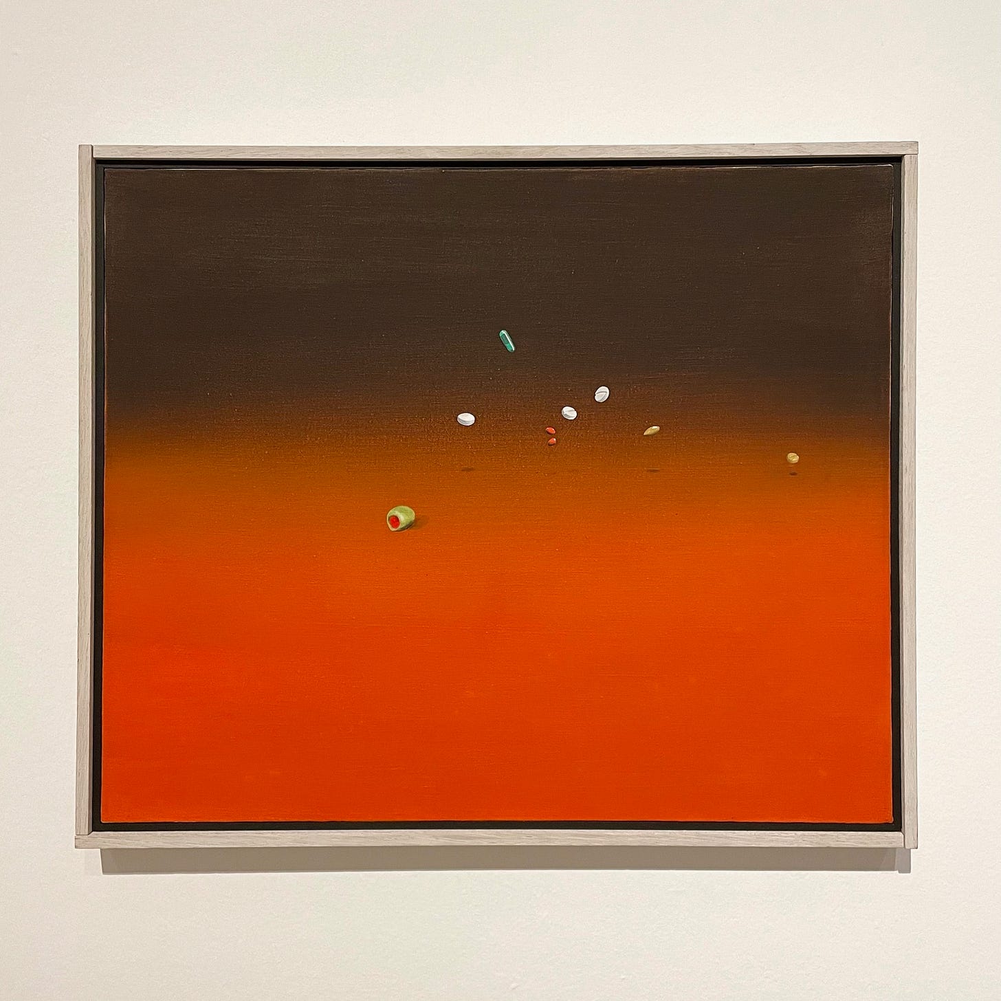
Ed is known for his word paintings, as well as the use of quirky and nonsensical imagery. Dry, deadpan, and banal. You’ve pretty much got to like all three if you’re going to enjoy Ed’s work. The above image of pills from 1969 is titled Painkillers, Trainquilizers, Olive. For me, this painting warns us not to even try to make sense of it. This deadpan humor through symbols is spot on.
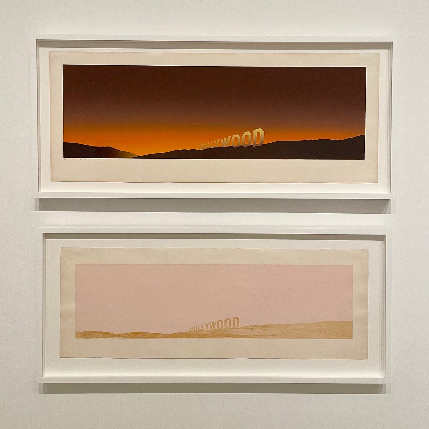
Another outside the box element of Ruscha’s work is his use of unconventional materials. The piece I was most excited and surprised to see was Spread from 1972. I’ve seen photos of Ed creating this piece, but had never seen it in person. The simple word SPREAD, written on both sides of a sheet of paper, were created by rubbing tobacco leaves, rather than paint. In the bottom image of the Hollywood sign, an image Ed worked with many times, the piece is made of Pepto Bismol and caviar. The layers of meanings, or just questions, are just endless throughout the many decades of Ed’s career.
The video above(sorry about the quality of my iPhone videos) shows the one installation from Ed’s career, Chocolate Room. Originally created in 1970, it’s been displayed seven or eight times in it’s fifty-four year existence. Created by hundreds of individual sheets of chocolate covered paper, this room is wonderfully experiential. In a world of virtual everything, this room is much needed. If you have a New York Times subscription, you can read a wonderful article about the making of Chocolate Room here.
I’d be remiss if I didn’t mention one iconic painting in the exhibition, which I neglected to take a photo of, Los Angeles County Museum of Art on Fire, 1965-68. This massive painting (over 11 feet wide), a depiction of the newly built museum engulfed in flames, tells us nothing and everything. Ed’s work is so often absurd or silly that you know going into the viewing of any painting not to take it literally. At the same time, when LACMA was built in ‘64, it was largely despised by Angeleno artists. In addition, artists were unhappy about their own exclusion from the art world institutions, so there are numerous possible meanings to be considered. Regardless, fast forwarding to 2024 as the old LACMA building was recently torn down completely and the new state of the art facility soon to be opened, the choice of hanging this painting in the very institution it sought to destroy is the perfect brand of Ed Ruscha irony.
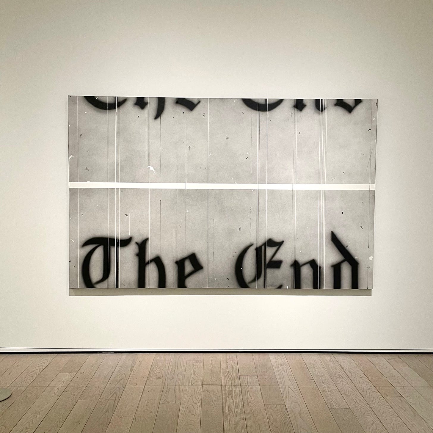
Once again giving the nod to Hollywood and the movies in his affectionate commentary on Los Angeles, Ed created The End in 1991. If you’re already a fan of Ruscha’s work and find yourself anywhere near LA in coming months, do make time for this show. I met my friend Charals there and he treated me to lunch at the diner at the Beverly Hills Hotel after the museum. Not a bad way to spend a day and I highly recommend it (thanks Charals!). Or perhaps the Brazilian BBQ at Farmer’s Market, just up the road. But do go. If you were previously unaware of Ed’s work, I hope I’ve shared my love for it in a way that starts a fire for you as well.

