Colorific...part one!
I’m goofy for color. I don’t recall exactly when I started thinking intently about my love of color. I do recall ongoing conversations on the subject with my friend Linda about twelve years ago, so maybe it was during that time. Linda is nuts for color too, and she’s a great Colorist. I’ll show you some of her work in a future post. I believe those conversations were really important to the development of my work. I was always highly influenced by color. I just don’t remember trying to put all the color pieces together before that time.
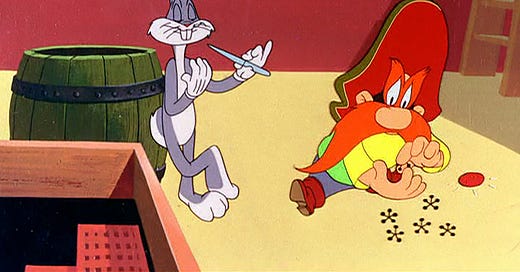
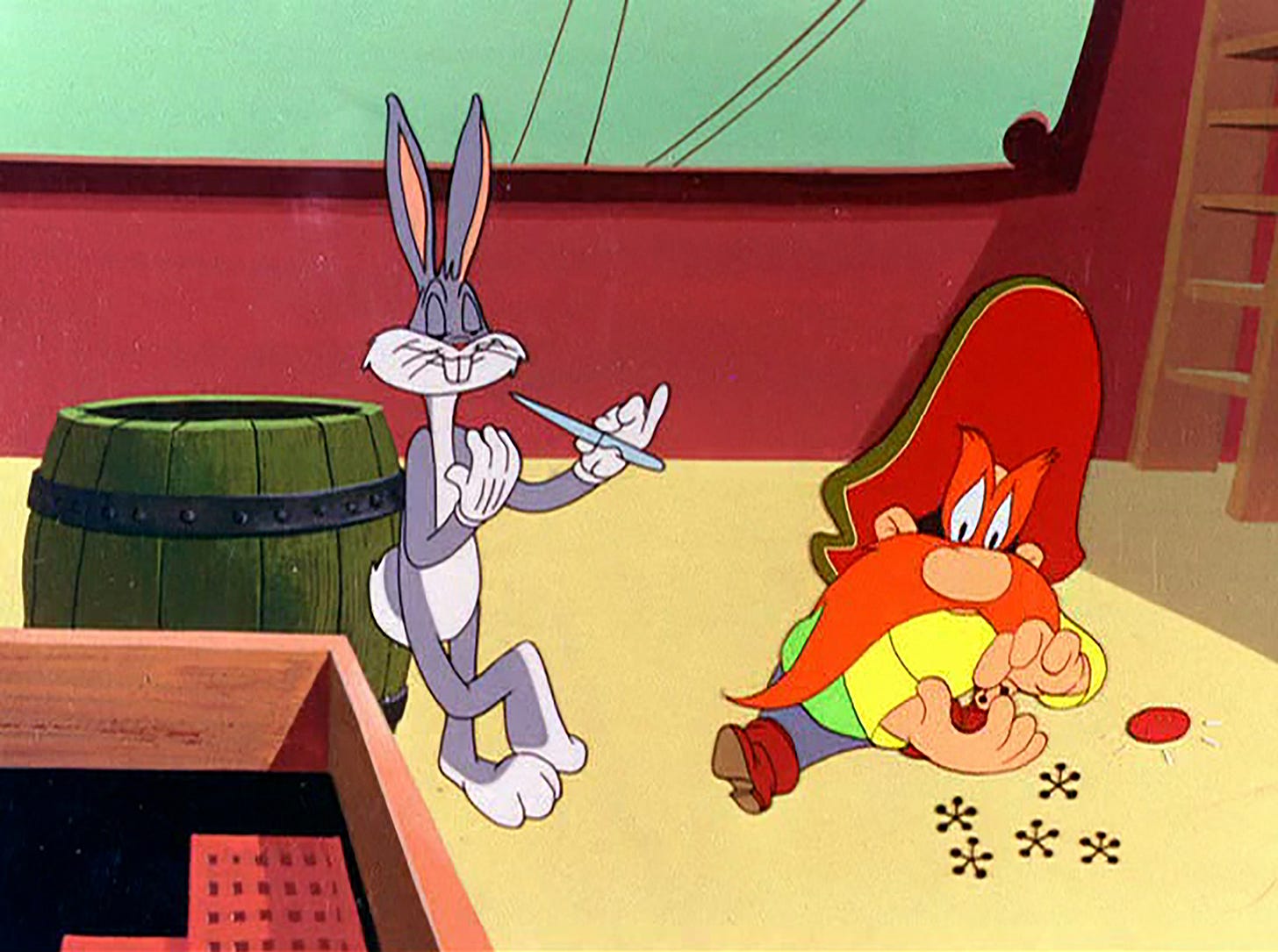
That said, I felt I should start this post with one of my favorite artists, Chuck Jones. Chuck’s cartoons were certainly my earliest experiences with color. As a kid, I absolutely loved Chuck’s era of Looney Tunes cartoons, as well as his masterpiece, How The Grinch Stole Christmas, and these are as fine examples of color mastery as I’ve seen anywhere. I still adore them. I loved these cartoons then, was practically addicted to them, but I was far too young to know why. I should point out that Chuck directed these cartoons, but they were created by a large group of artists at Warner Brothers, so my gratitude goes out to all of them. That said, it was during Chuck’s particular era that the colors took on a whole other quality.
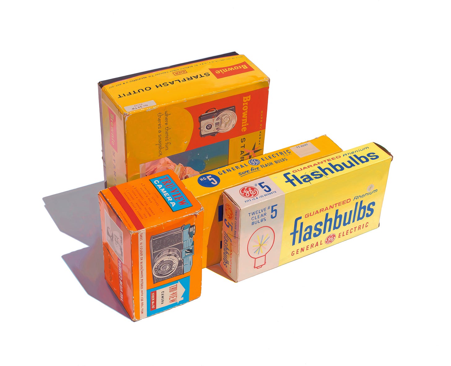
I wrote a post a few weeks ago about a painting I was working on, Candid Cameras, and promised to post an image of the final painting, above.
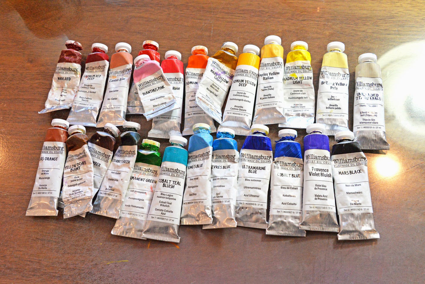
I’d been searching for a specific blue oil paint at some point, maybe ten years ago. You’d think any color can be mixed from others, but that’s not quite the reality. This particular color was being evasive, so I found certain areas of my paintings just a bit less than what I was hoping for. Eventually, I realized my friend, the painter Mary-Austin Klein, was painting the most beautiful skies and obviously had access to that evasive blue. I asked for her secret, one which artists don’t always necessarily share, and shouldn’t necessarily either. King’s Blue, from Williamsburg Oil Paints. Oh, how I fell in love with this paint. I’d never tried Williamsburg before, a hand made oil paint, and I’ll tell you, I was hooked. It’s by far my favorite oil paint, a whole other experience from other brands. A few years after King’s Blue made my day’s brighter, I was able to visit the Williamsburg factory in New Berlin, NY, which is also the factory for Golden Acrylics. I’d been invited for a private tour, and it was magical. I’d been expecting to see one of those huge automated machines, with tubes of paint whizzing by. The reality was much more charming. Each individual tube of Williamsburg paint is filled by one person standing at a machine just like the type one would make sausages with. I kid you not. Oh, the fun of being an artist.
In case you’re wondering, my favorite Williamsburg oil paint colors(each of which I use almost daily and has no comparison) are…
Sevres Blue
Persian Rose
Provence Violet Bluish
Unbleached Titanium Pale
Cadmium Orange
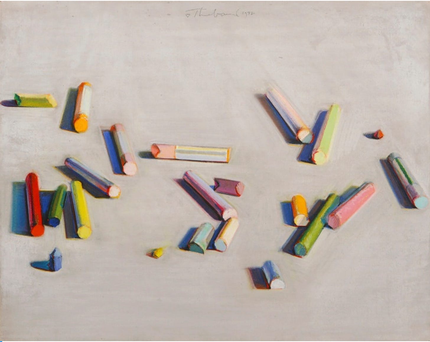
Do I love Wayne Thiebaud because I love color? Or do I love color because I love Wayne Thiebaud? Actually, it’s both. I took a drawing class in college and the required reading included an image of the above Pastel Scatter, by Wayne Thiebaud. I don’t recall the book, but the image stayed with me. I’d not heard of Thiebaud before that, but many of you know he’s my favorite artist. Perhaps the best Colorist of all time. But that’s silly. There are so many great Colorists. Nonetheless, he stands out as one of the greats, and although his talents seemed limitless, I believe his use of color was his greatest strength. I look closely at his paintings as often as possible, and I use little bits of what he was doing in every painting I make.
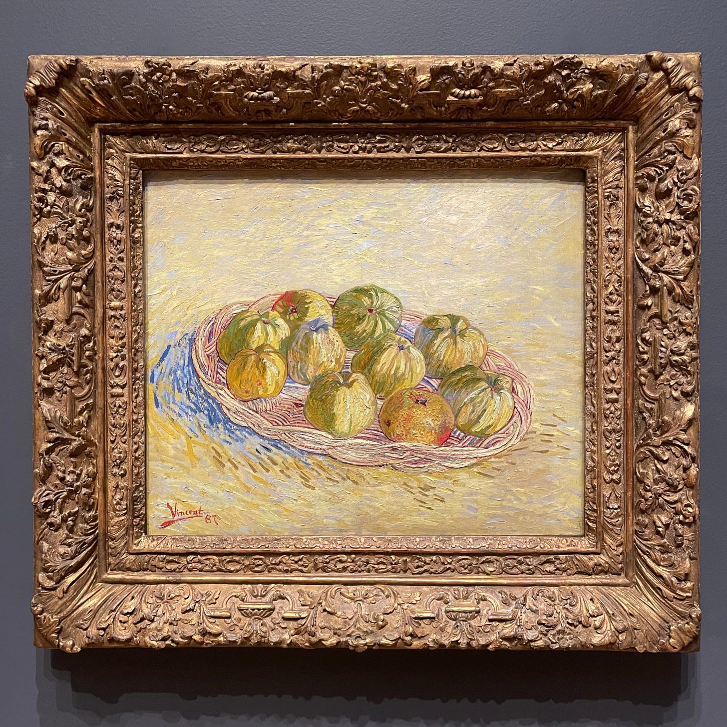
The only person I can think of with perhaps, and I mean perhaps, a more distinct use of color than Thiebaud is Vincent Van Gogh. There’s a reason we really love Van Gogh so much. His use of color gives us so much and is deserving of our affection. Van Gogh created about 800 paintings. Opinions differ on whether he sold none or one. How do we define success? I certainly wish his works would’ve sold during his time, and perhaps he would’ve made many more if he’d seen that particular success. Regardless, he was as successful as any artist in history with regards to color. It just took a while for humanity to figure it out. In the works of both Thiebaud and Van Gogh, you can look and look and never quite feel like you can understand their use of color. There’s a mystery, and this is what I love so much. Did their brains see color differently than most people? If so, did they know it, or did they just love color?
In reality, the use of color that we love so much in Van Gogh’s work only came about in the last few years of his life. As he became exposed to the work of the Impressionists in France, his own work was taken over by color. Fortunately, he was perhaps more productive in his last two years than any artist in history, creating hundreds of vibrant masterpieces.
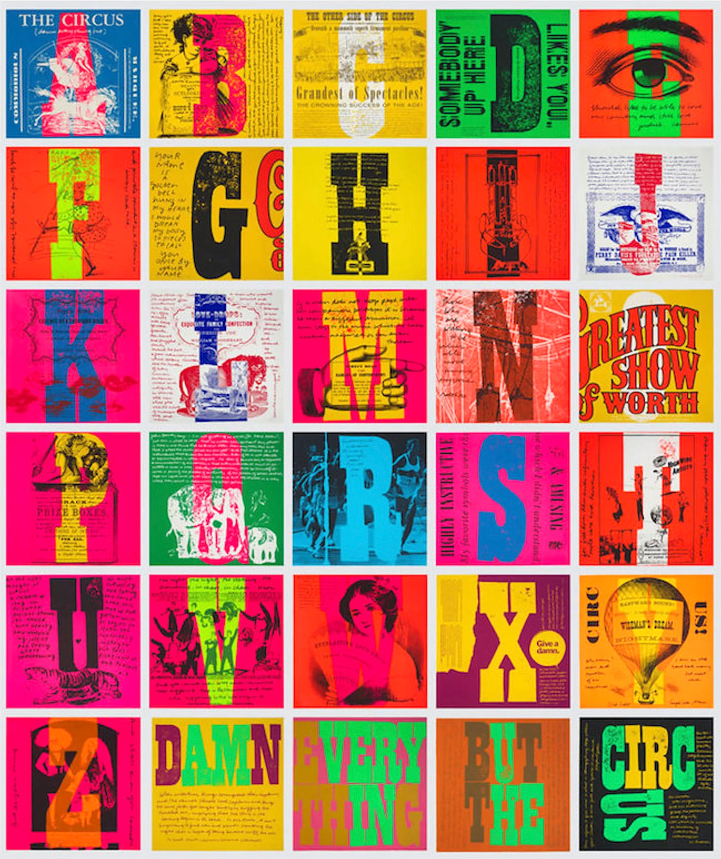
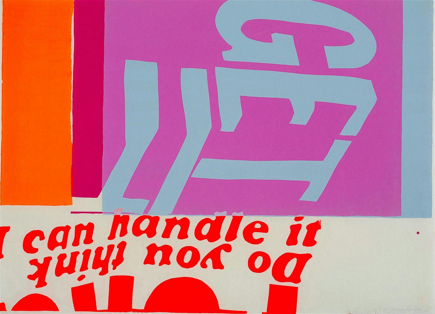
I can’t handle it, despite the title to the contrary. One of my all time faves, and I just mean all time faves. This work, all of her work, just knocks me out. This is Corita Kent, also known as Sister Mary Corita, and her work is beyond words. I would’ve loved to have met Sister Mary Corita. It seems like her heart was made of pure gold. An iconic Los Angeles artist, she taught art and created these stunning serigraphs along with watercolors, photography and other works.
Most times when I think of Corita’s work, I’m reminded of Andy Warhol. It’s not that her work reminds me of his work. Just the opposite. But they were working at the same time and some elements of their work did overlap. She was West Coast while he was East. He was by far the better known artist. Being a woman, the chance of her work being recognized at the time was who knows just how much less. Less. However, her work interests me so much more than his. I’m just saying for me. Warhol was great, did amazing things, and I’m glad he’s so respected. I just adore her work so much.
That’s all for part one. What do Palm Springs, Marfa, Texas, and Paris have in common? Probably lots of things, actually, but I’ve got one thing in mind, and it has to do with color. I’m saving that for part two. Cheers!

