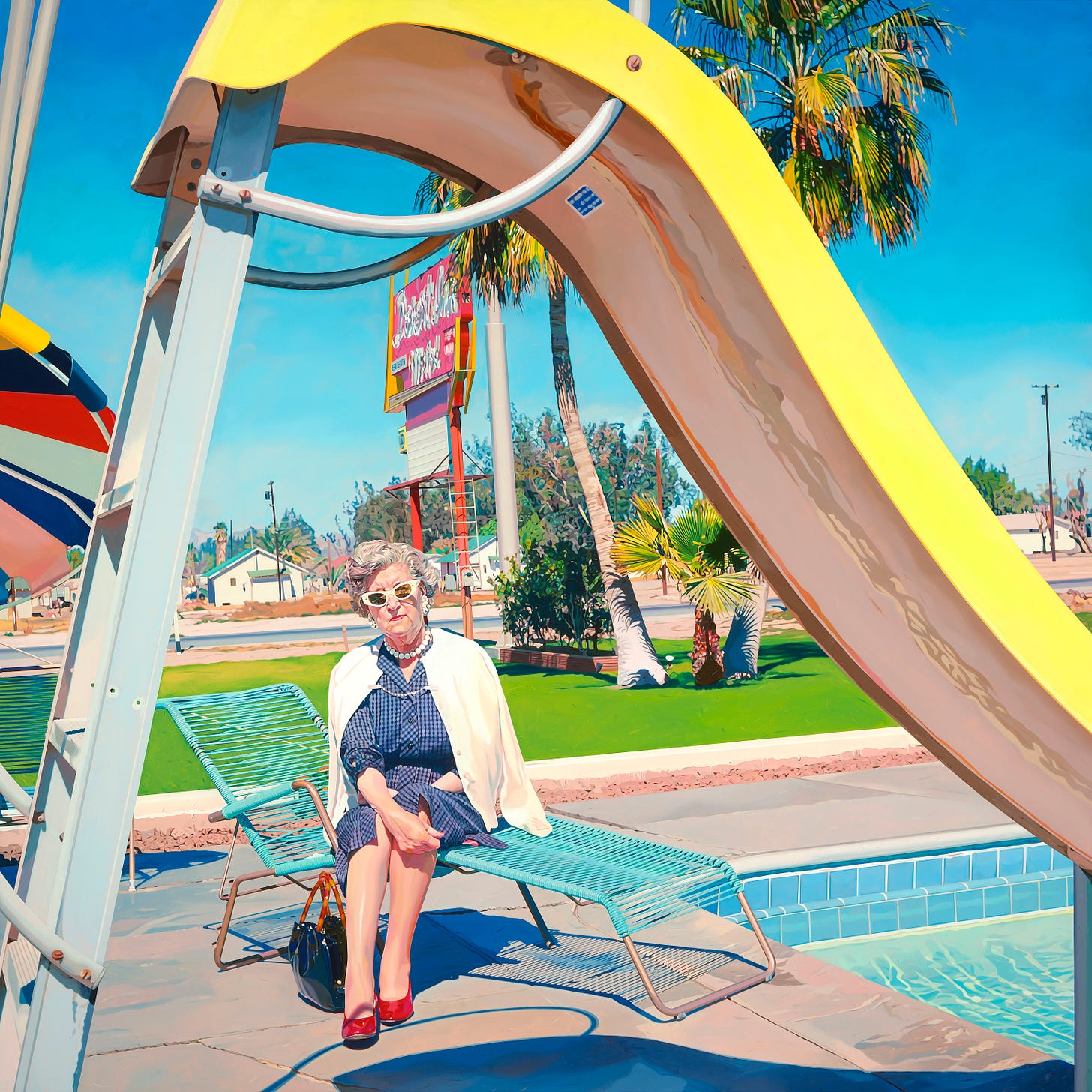
I had planned to write about my three favorite shops in this post. An odd subject, I suppose, but these are no ordinary shops and they have color in common. However, I decided on a detour, as I was itching to write about my love of CMYK. I’ll write about my favorite shops in Part 3 very soon.
Is it weird to love CMYK? Perhaps. I think about CMYK all the time though. I even had an appointment to get these CMY overlapping circles tattooed on my arm a couple years ago, and if the tattoo artist hadn’t been under the weather, I’d be sharing a photo of my ink in this post. Hopefully another time.
I’d been hoping to experiment with CMYK color separation in my work for a few years before I was able to find time to do it, first with Desert Dorothy, and then Ineffable. These paintings are some of my favorites and I hope to do many more CMYK works.
I was first exposed to CMYK color separation at my first job, at the 45 Minute Photo Lab, in Downey, CA. I wish I had photos of the lab, but ironically, couldn’t find a thing. Oh well. I was 16, and I worked at the lab for many years while juggling school and mural work. As people dropped off their rolls of film, I’d sit at a huge Noritsu processing machine, looking at negatives one by one and making decisions on how much color tweaking needed to be done. “Plus one cyan”. “Minus two yellow”. The lab’s owner trained me on how to see what colors might be lacking in a negative. As the prints came out of the machine, if the colors were off, I’d reprint individual frames with added tweaking. I became pretty good at seeing color, and I enjoyed the job, but I wasn’t much thinking about CMYK in any other context. There was a line in an episode of NYPD Blue, many years ago, that always stuck with me. “The future keeps telling us what the past was about”. Great line, and fitting here. Only much later in life did I remember back to those early days in the the lab, checking CMYK levels.
We also had to run test prints each morning as we started the Noritsu. These weren’t photos. They were simply odd patterns and strips of C, M, Y and K, to make sure everything was flowing correctly before we started printing from negatives. I hope this isn’t all completely boring for you, but I’m amazed how seemingly banal events can have such a powerful influence. In addition to test prints, the Noritsu would occasionally either have a paper jam, or some other difficulty, and things would shut down mid print. In these instances, I might find a half printed image, the rest of the 4”x6” print in white. I suppose we still have these issues with our home printers…same premise.
As a machine would have difficulty, it would simply stop printing wherever it was in the image. This randomness interests me, for of course the printer doesn’t see an image. It’s simply processing ink in relation to a programmed interpretation of a negative(or now, a digital image).
When I started experimenting with CMYK as potential paintings, it makes sense that I landed on this approach. White space, hard edge, random cropping. I had painted There’s No Place Like a couple years before revisiting the image as a CMYK abstraction in Desert Dorothy. I fell in love with the process and the results. We are often taught to think of white space as nothing more than white space, and that can certainly be true at times. However, a white field, which is actually “negative space” in this painting, plays many roles. It’s kind of wrong to describe a painting in this way, taking away some of the magic of making and experiencing art, but it also informs the experience. In Desert Dorothy, and in Ineffable, the negative space gives the viewer a chance to imagine what “might be” in that space. This is where our imaginations naturally go. “What’s that thing at the top of the image? Is that one of those old pool slides?” Or, “I wonder what that girl looks like, or if she’s smiling, or making a funny face?” If I crop the negative space one way, your mind might fill in the imaginary background one way. If I crop it another, the viewer’s brain will fill it in a different way as well.
The negative space in these paintings is supposed to have two additional effects. First, the negative space pushes your eye toward the color strips, the “positive” space. It’s a form of manipulation, of the image telling the viewer what to look at. Second, the negative space serves as a relief to the positive space, and the two spaces have something very different to offer for your brain. Neither is right or wrong, and they’re not exactly competing nor conversing with each other. Negative space can be very calming, as there is nothing in the space demanding one’s attention. Positive space, especially in a crammed space with lots of visual information, can be quite demanding of your attention. I’m sure everyone’s brain would see these paintings, as all paintings, differently, and that’s wonderful. Obviously, I can only speak to my intent or to what’s happening in my own brain with regards to these images. My brain tends to go back and forth between a kind of supercharged excitement in the “positive” areas, looking at all the details and colors, and a calm, quiet experience in the “negative” area.
OK, so what exactly is CMYK color separation, or how does it work? Every color image can be separated into C(cyan), M(magenta), Y(yellow), and K(key, an old school printing term, generally referring to black). What does this mean? Well, let’s look at the sky in the Ineffable image above. It’s actually a blue sky that is made up of predominantly cyan mixed with a little magenta. There is actually no yellow whatsoever in that particular sky. However, if we were able to tilt our heads toward the sun, the sky would certainly have more yellow. In this image, when I color separate, the only yellow in the area of the center strip was in the skin and clothing of the two figures seen in that strip.
In the Desert Dorothy image, the middle strip represents what we see with CMY, and K. The C strip only shows us what we would see in that moment if we were able to remove all yellow, magenta and black from the scene. Some dark areas would instantly become very light, as there may be no cyan in that area, and vice versa.
At this point, I’m not sure if this is making sense at all, and if it is, if it’s of any interest, so I’ll stop. Nonetheless, abstraction in art has always been about breaking things down. There are many ways to do this. Mine is an analytic brain, and I love hard edge and details, so I find great enjoyment in going down the rabbit hole of this particular brand of abstraction.
OK, colorful shops coming in Part 3.


